

In the world of online content, thumbnails play a critical role in attracting viewers. Whether you are posting on YouTube, social media, or a blog, the thumbnail is often the first thing your audience sees. A well-designed thumbnail can mean the difference between someone clicking your content or scrolling past it. Designing eye-catching thumbnails requires a mix of visual appeal, clarity, and strategic thinking. Here is how you can create thumbnails that grab attention and encourage clicks.
1. Understand the Purpose of a Thumbnail
A thumbnail acts as a visual summary of your content. Its purpose is not only to represent the video or post accurately but also to spark curiosity. When people browse through dozens of videos or posts, they make split-second decisions about what to watch. The thumbnail should therefore stand out and communicate the value or emotion behind your content. It needs to be both visually appealing and contextually relevant.
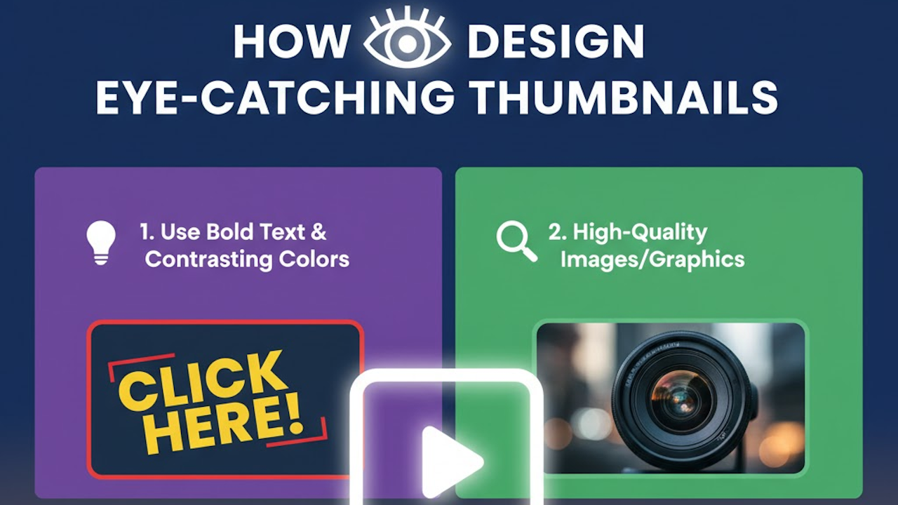
2. Use Bold and Clear Imagery
Strong visuals are the foundation of any good thumbnail. Use high-resolution images that are sharp and clear even at small sizes. Blurry or cluttered images tend to get lost among other thumbnails. Choose a subject that instantly conveys the main idea of your content. For example, if your video is about cooking pasta, show a mouth-watering image of the finished dish rather than a vague kitchen scene.
It also helps to isolate the subject by blurring the background slightly or using contrast to make it pop. Faces with expressive emotions often perform well because they create a personal connection and convey feelings that draw attention.
3. Choose a Consistent and Striking Color Palette
Color can make your thumbnail stand out on a crowded page. Use bright, contrasting colors to catch the eye. For instance, pairing warm colors like red or orange with cool tones like blue can create visual balance and energy. However, it is important not to overdo it. Too many colors can make a thumbnail look chaotic.
Consistency is also key. If you are building a brand or a YouTube channel, develop a color palette that becomes part of your visual identity. This consistency helps your audience recognize your content instantly. Many successful creators use a similar color scheme across all thumbnails to reinforce their brand image.
4. Incorporate Readable Text
Text can clarify what your content is about and add intrigue. Keep the text short and impactful, usually no more than five or six words. The font should be bold and easy to read, even on small screens. Avoid using fancy or thin fonts that lose clarity when resized.
Placement also matters. Make sure the text does not cover important parts of the image. Use contrasting colors between the text and the background to improve legibility. Adding a subtle drop shadow or outline can further enhance readability. For example, white text with a black outline works well in most cases.
5. Use Composition to Guide the Viewer’s Eye
Good design relies on composition. Follow visual principles such as the rule of thirds to create balance. Position the main subject slightly off-center to make the image more dynamic. Use lines, shapes, or lighting to guide the viewer’s eye toward key elements like the face or text.
Another useful technique is to leave some breathing room around your subject. Avoid filling every corner with details. Simplicity helps viewers focus on the main message and prevents visual overload.
6. Reflect the Content Accurately
An eye-catching thumbnail should still be honest. Misleading thumbnails might get clicks in the short term, but they harm your credibility over time. If your thumbnail promises something the video does not deliver, viewers will feel tricked and may not return. Choose visuals and text that represent the core idea truthfully while still generating curiosity.
For instance, if your video is about improving productivity, a thumbnail that shows a messy desk transforming into an organized workspace conveys both the topic and the appeal of change.
7. Include Your Branding Elements
Brand recognition builds loyalty. Adding a logo, a consistent layout, or a recognizable font can help establish your identity. You do not need to make branding elements dominant; subtle repetition is enough. Over time, viewers will begin to associate that look with your quality and style.
Consistency in branding also improves professionalism. A cohesive set of thumbnails signals that you take your content seriously, which increases trust.
8. Test Different Designs
Designing effective thumbnails is an ongoing process. What works for one audience might not work for another. Try creating multiple versions and test them to see which one performs best. Pay attention to metrics like click-through rate and watch time. Sometimes, small adjustments such as changing the color contrast or simplifying the text can make a big difference.
Over time, patterns will emerge that reveal what appeals most to your viewers. Use those insights to refine future designs.
9. Use Tools and Templates
You do not need to be a professional designer to create great thumbnails. Many tools like Canva, Adobe Express, or Fotor offer templates that make design simple. These tools provide pre-sized layouts, font pairings, and color palettes that can speed up your workflow. Templates are especially useful for maintaining a consistent look across multiple videos or posts.
10. Keep Mobile Users in Mind
Most people view content on mobile devices, where thumbnails appear much smaller. Always preview your design at different sizes to ensure that key elements remain visible and readable. Avoid clutter, small text, or overly detailed backgrounds. A simple, high-contrast design will look much better on both small and large screens.
11. Evoke Emotion or Curiosity
Emotion drives engagement. Thumbnails that make people feel something—curiosity, excitement, surprise, or inspiration—tend to get more clicks. Use expressions, action shots, or intriguing scenarios to create an emotional pull. You can also hint at a story by showing a before-and-after scene or a moment of tension that makes viewers want to know what happens next.
Conclusion
Designing eye-catching thumbnails is both an art and a science. It requires creativity, strategic thinking, and consistency. The best thumbnails are simple yet powerful. They use bold imagery, strong contrast, clear text, and accurate representation to draw attention. By understanding your audience and testing different approaches, you can craft thumbnails that not only attract clicks but also reflect the quality of your content. Over time, well-designed thumbnails become a visual signature that strengthens your brand and boosts your online presence.