

Thumbnails are the small preview images that represent videos, blog posts, products, or other content across digital platforms. They serve as the first impression for potential viewers and play a crucial role in determining whether someone clicks on your content or scrolls past it. In a world where attention spans are short and competition for views is fierce, creating eye-catching thumbnails can significantly boost engagement, click-through rates, and overall visibility.
Whether you are a YouTuber, blogger, marketer, or social media creator, mastering thumbnail design is an essential skill. This comprehensive guide will walk you through the fundamentals, strategies, and practical techniques to create thumbnails that stand out and drive results. We will cover everything from understanding viewer psychology to implementing advanced design elements, all while keeping the process accessible for beginners and insightful for experienced designers.
Why Thumbnails Matter in Digital Content
Thumbnails act as visual hooks in an overcrowded online space. On platforms like YouTube, they can account for up to 90 percent of the decision-making process when users choose what to watch. A compelling thumbnail increases curiosity and promises value, leading to higher click rates.
Beyond clicks, well-designed thumbnails contribute to better algorithmic performance. Platforms favor content with strong engagement metrics, and attractive thumbnails help initiate that engagement cycle. They also reinforce your brand identity, making your content instantly recognizable in feeds or search results.
Poor thumbnails, on the other hand, can lead to missed opportunities. Blurry, cluttered, or generic images fail to capture attention and may even harm your credibility. Investing time in thumbnail design pays dividends through sustained audience growth and better conversion rates.
Core Principles of Eye-Catching Thumbnail Design
Successful thumbnails follow several key design principles that tap into human visual psychology.
High Contrast and Bold Colors
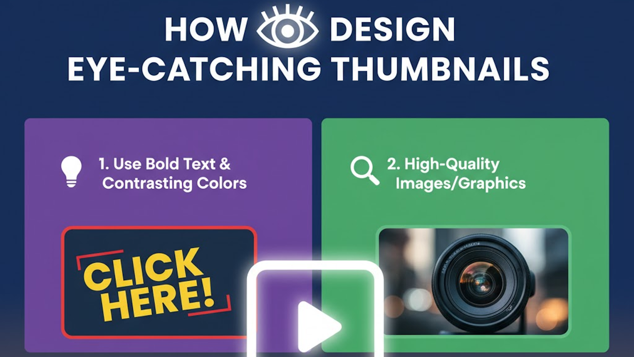
Contrast draws the eye immediately. Use bright, saturated colors against darker backgrounds or vice versa to make elements pop. Avoid muted tones that blend into platform interfaces. For instance, a vibrant red or yellow can signal urgency or excitement, while blue conveys trust and calmness.
Test color combinations for visibility on different devices. What looks good on a desktop monitor might wash out on a mobile screen. Aim for a color palette that aligns with your content theme while remaining highly visible at small sizes.
Clear Focal Point
Every thumbnail needs a single dominant element that viewers notice first. This could be a person’s face showing strong emotion, a striking product shot, or a bold graphic. Keep the composition simple so the focal point is unmistakable even when the image is scaled down to 300 by 200 pixels or smaller.
Readable Text
Text is often essential for context, but it must be legible at thumbnail size. Use large, sans-serif fonts with thick strokes. Limit text to a few words, ideally three to six. Place text in high-contrast areas and consider adding subtle shadows or outlines for better readability against busy backgrounds.
Emotional Appeal
Thumbnails that evoke emotions perform exceptionally well. Surprise, curiosity, joy, or intrigue can compel clicks. Exaggerated facial expressions, dramatic scenes, or teaser questions in text tap into these emotional triggers effectively.
Consistency with Branding
Maintain a consistent style across your thumbnails to build recognition. Use the same color scheme, font choices, and layout patterns. This helps viewers associate the thumbnail with your channel or brand instantly.
Step-by-Step Guide to Designing Thumbnails
Follow this structured process to create professional thumbnails systematically.
Step 1: Research and Planning
Begin by studying successful thumbnails in your niche. Analyze what works for top creators: note their use of colors, text placement, and imagery. Identify trends without copying directly.
Define your thumbnail’s goal. Is it to inform, entertain, or sell? Decide on the main message and the key visual that represents it. Sketch rough ideas on paper or a digital canvas before opening design software.
Step 2: Gather or Create Visual Assets
Collect high-quality images or create custom graphics. Use original photos when possible for authenticity. If sourcing stock images, choose ones with clear subjects and good lighting.
For custom elements, consider illustrations, screenshots, or 3D renders. Ensure all assets have sufficient resolution to avoid pixelation when resized.
Step 3: Compose the Layout
Start with a canvas sized appropriately for your platform. YouTube recommends 1280 by 720 pixels, while other sites may vary. Work at higher resolution and export down to maintain sharpness.
Arrange elements using the rule of thirds for balanced composition. Place the focal point off-center for dynamism. Leave negative space around key areas to prevent clutter.
Layer elements thoughtfully: background, main subject, text, and accents. Ensure each layer serves a purpose and enhances visibility.
Step 4: Add Text and Effects
Craft concise, benefit-driven text. Phrases like “Beginner Hack” or “Shocking Results” spark interest. Position text at the top or bottom to avoid covering the main subject.
Apply subtle effects like bevels, glows, or gradients sparingly. Overuse can make designs look dated or unprofessional. Test how effects appear at reduced sizes.
Step 5: Review and Optimize
Zoom out to thumbnail scale frequently during design. Check contrast using online tools or by viewing on different screens. Get feedback from others to gauge effectiveness.
Optimize file size for fast loading without sacrificing quality. Use appropriate formats like JPG for photos or PNG for graphics with transparency.
Step 6: Test Performance
Upload and monitor how your thumbnail performs in real conditions. Track click-through rates and iterate based on data. A/B testing multiple versions can reveal what resonates best with your audience.
Essential Tools for Thumbnail Creation
Several tools cater to different skill levels and budgets.
Free Options
Canva offers drag-and-drop templates specifically for thumbnails. Its library of elements and easy customization makes it ideal for beginners.
GIMP provides powerful open-source editing capabilities similar to premium software. It supports layers, masks, and advanced effects.
Photopea runs in a web browser and mimics Photoshop’s interface without any installation.
Professional Software
Adobe Photoshop remains the industry standard for detailed thumbnail work. Its extensive features support complex compositions and precise adjustments.
Affinity Photo delivers similar power at a one-time purchase price, making it a cost-effective alternative.
Specialized Thumbnail Tools
Thumbnail Blaster and similar apps automate parts of the process with templates and AI suggestions. These can speed up production for high-volume creators.
Mobile apps like PicsArt or Adobe Express allow on-the-go editing for quick iterations.
Best Practices for Different Platforms
Tailor your approach to each platform’s unique requirements and user behaviors.
YouTube Thumbnails
YouTube thumbnails benefit from close-up faces with expressive emotions. Include video-specific numbers or results when relevant. Maintain aspect ratio at 16:9 and ensure text does not get cropped on mobile views.
Social Media Platforms
Instagram and Twitter favor square or vertical formats. Use bold graphics and minimal text since these platforms display thumbnails in dense feeds. Vibrant colors help combat scrolling fatigue.
Blog and Website Thumbnails
These often appear alongside text, so prioritize clarity over hype. Subtle designs that match your site’s aesthetic perform better than overly promotional ones.
E-commerce Product Thumbnails
Focus on clean product shots with plain backgrounds. Highlight key features or benefits through annotations rather than dramatic styling.
Common Mistakes to Avoid
Many creators undermine their thumbnails with avoidable errors.
Cluttered designs confuse viewers and reduce impact. Stick to one main idea per thumbnail.
Using low-resolution or stretched images damages professionalism. Always start with high-quality assets.
Ignoring mobile optimization leads to poor performance since most browsing happens on phones. Test thoroughly on small screens.
Over-relying on trends without originality can make your content blend in. Adapt popular styles to fit your unique voice.
Neglecting A/B testing means missing opportunities to refine what works. Data-driven decisions outperform guesswork.
Advanced Techniques for Superior Thumbnails
Once comfortable with basics, incorporate these methods to elevate your designs.
Typography Mastery
Experiment with font pairings: one bold display font for headlines and a simpler one for supporting text. Custom lettering or distorted text can add personality when used judiciously.
Lighting and Shadow Effects
Simulate dramatic lighting to create depth. Drop shadows on text and objects separate layers visually and add dimension.
Custom Illustrations and Icons
Hand-drawn elements or vector graphics differentiate your thumbnails. Simple icons can convey complex ideas quickly.
Color Psychology Deep Dive
Beyond basic contrast, study how specific hues influence mood. Orange suggests energy and creativity, while green implies growth and freshness. Use these associations to reinforce your content’s message.
Motion and Animation Considerations
For platforms supporting animated thumbnails or GIFs, design with subtle movement in mind. Static versions should still work effectively as fallbacks.
Cultural and Demographic Adaptation
Consider your target audience’s preferences. Colors and symbols carry different meanings across cultures. Younger viewers may respond to memes or trendy aesthetics, while professional audiences prefer clean and authoritative designs.
Measuring Success and Iterating
Track key metrics like click-through rate, watch time, and audience retention. Tools built into platforms provide these insights directly.
Create a thumbnail library organized by performance. Review past successes to inform future designs.
Stay updated on design trends through communities and resources, but always prioritize what performs for your specific content.
Conclusion: Building a Thumbnail Strategy for Long-Term Success
Designing eye-catching thumbnails is both an art and a science. It requires understanding visual communication, audience psychology, and platform dynamics. By following the principles and steps outlined here, you can create thumbnails that not only attract clicks but also set accurate expectations for your content.
Consistency, experimentation, and continuous learning are the keys to improvement. Start simple, analyze results, and gradually incorporate more sophisticated techniques. Over time, your thumbnails will become powerful assets that enhance your brand and accelerate your growth in the competitive digital landscape.
Remember that great thumbnails complement strong content. They serve as invitations to valuable experiences, so invest in both creation and delivery. With practice and attention to detail, you will master the craft of thumbnail design and watch your engagement metrics soar.