

Color surrounds us constantly, shaping our perceptions in ways both obvious and subtle. Color psychology examines how different hues influence human emotions, behaviors, cognition, and motivation. This field draws from evolutionary biology, learned cultural associations, and physiological responses to light wavelengths. Creativity thrives on divergent thinking, novel connections, emotional openness, and sustained motivation. Certain colors can nudge the mind into states that support these processes while others may hinder them by increasing tension or narrowing focus. Understanding these effects allows individuals, designers, educators, and organizations to harness hues intentionally for greater innovation and idea generation.
The mechanisms involve both automatic bodily reactions and higher-level associations. Warm colors like red and yellow tend to increase physiological arousal, raising heart rate and alertness. Cooler colors such as blue and green often lower arousal, promoting calm and sustained attention. These responses trace partly to evolutionary signals: red can signal danger or ripeness, green often indicates safety and growth in natural environments, and blue evokes clear skies or water. Over time, cultural meanings layer on top, reinforcing or modifying these effects. Research shows that even brief exposure to a color before a task can alter performance, demonstrating how environmental cues prime cognitive styles. When the goal is creativity rather than precision, colors that encourage exploration, reduce anxiety, and spark positive affect tend to perform best.
Red: Energy with Caution
Red ranks among the most stimulating colors. It is linked to passion, urgency, power, and excitement. Physiologically, red increases metabolism, respiration, and blood pressure, drawing immediate attention. These qualities make it effective for signaling importance or boosting short-term energy. However, red also activates avoidance motivation in many contexts, prompting caution, detail orientation, and a focus on avoiding mistakes.
A landmark 2009 study by Ravi Mehta and Rui Zhu demonstrated this clearly. Participants performed cognitive tasks on computer screens with red or blue backgrounds. On red screens, people excelled at detail-oriented work such as proofreading and word recall. They generated fewer original ideas on creative tasks, such as listing unusual uses for a brick or completing remote-associates problems that require broad thinking. Red parts in a toy-design exercise led to more practical but less novel designs. The researchers attributed the pattern to red evoking an avoidant motivational state, useful for accuracy but less conducive to the open, exploratory mindset creativity requires.
For creative work, red serves best in measured doses. It can energize a team during the execution phase of a project or highlight key elements in a presentation. In workspaces, red accents on a predominantly calmer palette can provide bursts of focus without overwhelming the environment. Overuse risks elevating stress and narrowing idea generation. Individuals who thrive under mild pressure may benefit from red clothing or accessories during brainstorming sessions, but most people find softer hues more reliable for sustained creative flow.
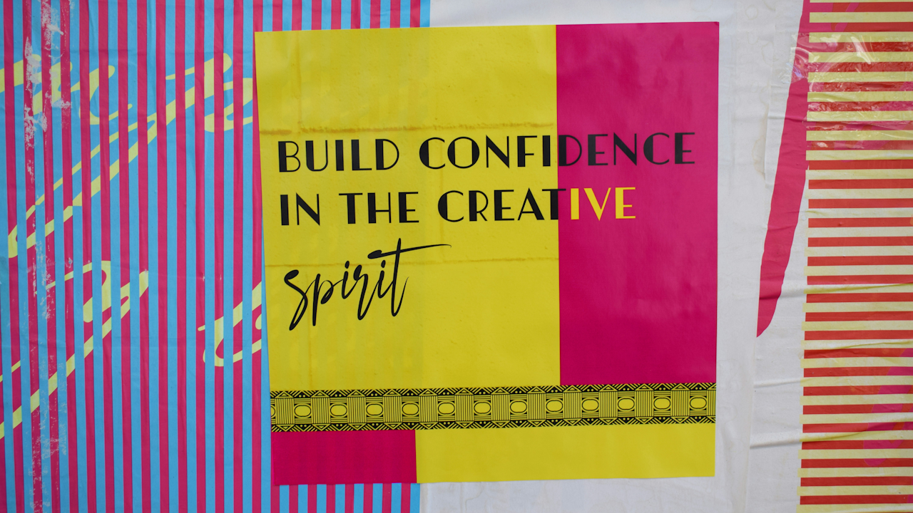
Orange: Warmth and Communicative Spark
Orange blends the energy of red with the cheer of yellow. It is associated with enthusiasm, joy, sociability, and stimulation. This hue promotes a sense of warmth and approachability, encouraging communication and extraversion. In creative settings, orange can lower social inhibitions and foster collaborative energy, making it valuable in group ideation sessions or open-plan studios.
Because it combines stimulation with positivity, orange helps combat creative blocks caused by low mood or isolation. It works particularly well as an accent color in meeting rooms or collaboration zones. Designers often pair orange with neutral bases to inject vitality without visual fatigue. In personal creative practice, an orange notebook or desk lamp can signal a shift into playful, idea-generating mode. The color’s uplifting quality supports the emotional resilience needed when ideas initially fail or require iteration.
Yellow: Optimism, Intellect, and Mental Activation
Yellow stands out as one of the strongest colors linked directly to creativity. It is associated with happiness, intellect, energy, and new beginnings. Psychologically, yellow stimulates mental activity, heightens awareness, and produces a warming, cheerful effect. It can unclog mental blocks and encourage fresh perspectives by activating areas involved in rational and creative processing. Many sources note its value in environments meant for brainstorming and fresh initiatives.
In practice, yellow excels at lifting mood and promoting divergent thinking. It signals optimism, which reduces the fear of judgment that often stifles early-stage ideas. Creative agencies and design studios frequently incorporate yellow in accent walls, furniture, or lighting to maintain high energy throughout long sessions. On a personal level, surrounding oneself with yellow during writing or sketching can foster a sense of possibility. However, overly bright or saturated yellow can become overwhelming, leading to irritation or mental fatigue if used excessively. The key lies in balance: soft buttery yellows or golden tones tend to inspire without overstimulation, while neon versions suit short bursts of activity.
Green: Growth, Balance, and Nature’s Creative Cue
Green occupies a special place in color psychology for its dual qualities of calm and gentle invigoration. It is tied to nature, growth, harmony, freshness, and healing. These associations create a soothing yet vital atmosphere that supports both relaxation and productive thinking. Green slows metabolism slightly while maintaining alertness, reducing the mental fatigue that kills creativity.
A 2012 study by Stephanie Lichtenfeld and colleagues provided direct evidence. Participants viewed a green or white rectangle before generating uses for a tin can. Those exposed to green produced significantly more creative ideas. The researchers proposed that green acts as a cue for striving toward improvement and mastery, facilitating the growth-oriented mindset essential for innovation.
Beyond the laboratory, green supports biophilic responses. Incorporating plants or green elements in workspaces connects people to natural patterns that humans evolved alongside, lowering stress and freeing cognitive resources for imagination. Green proves especially effective in home offices, studios, and educational settings where sustained creative work occurs. It pairs beautifully with wood tones and natural light, amplifying feelings of grounded possibility. For individuals prone to anxiety during creation, green environments offer a safe psychological container in which ideas can emerge without pressure.
Blue: Calm Exploration and Expansive Thinking
Blue is frequently celebrated for its calming properties, yet research reveals it also powerfully supports creativity through a specific motivational pathway. Blue is linked to serenity, trust, depth, and introspection. Physiologically, it tends to lower heart rate and create a sense of spaciousness. This calm state reduces the internal noise that interferes with making unexpected connections.
The same 2009 Mehta and Zhu experiments that highlighted red’s limitations showed blue’s strengths. Participants working against blue backgrounds generated higher-quality and more original ideas on the brick-uses task and performed better on remote-associates problems requiring broad semantic connections. In the toy-design exercise, blue parts produced more novel and imaginative results. The authors explained that blue induces an approach-oriented, exploratory motivational state ideal for creativity, in contrast to red’s avoidant focus.
Blue therefore suits deep creative work such as writing, strategic thinking, or complex problem solving. In office design, soft blues and teals work well for individual workstations or brainstorming rooms where psychological safety encourages risk-taking with ideas. Digital creators often choose blue-toned interfaces or wallpapers to maintain focus during long sessions. Because blue can also feel cool or distant if overused, combining it with warmer accents prevents emotional flatness. The color’s association with vast skies and oceans metaphorically expands mental horizons, making it a reliable ally for expansive, original thinking.
Purple: Imagination, Wisdom, and Visionary Depth
Purple carries rich symbolic weight, blending the energy of red with the calm of blue. It is associated with royalty, mystery, spirituality, wisdom, and creativity. This combination evokes higher-order thinking, imagination, and a sense of magic or transcendence. Purple encourages individuals to reach beyond the ordinary, making it particularly suited to artistic, conceptual, and visionary work.
In creative contexts, purple signals permission to explore unconventional territory. It appears in the branding of innovative companies and in artists’ studios where boundary-pushing occurs. Lighter lavenders and violets promote gentle introspection, while deeper indigos add intensity and focus. Because purple is less common in everyday environments, its presence can create a distinct psychological space dedicated to creative exploration. Writers, designers, and strategists often report that purple accents or lighting help shift them into a more imaginative frame of mind. As with all colors, moderation prevents the hue from feeling overly somber or disconnected from practical execution.
Neutrals and the Art of Balance
Neutral colors provide essential grounding. White suggests purity, openness, and new beginnings; it invites reflection and can feel highly creative when paired with light and space. However, large expanses of stark white may appear sterile and inhibit warmth. Gray offers neutrality and professionalism but risks boredom and diminished energy if dominant. Black conveys sophistication and authority yet can feel heavy or constricting for idea generation.
The most effective creative environments use neutrals as a calm base and layer in chromatic accents. A predominantly white or light-gray room with yellow chairs, a green plant wall, or blue textiles creates visual interest and psychological variety. This approach allows the space to adapt to different creative phases: calm blues and greens for ideation, energetic yellows and oranges for development, and focused accents for refinement. Personalization matters greatly. Some creators thrive in vibrant, multi-colored studios; others need minimalist palettes with single strategic pops of color.
Designing Environments That Foster Creativity
Applying color psychology in real settings requires attention to context, lighting, and individual differences. In workplaces, successful strategies often include blue or green tones for main walls and collaborative areas to support calm exploration, yellow or orange accents in ideation zones for energy, and purple elements in strategy or concept rooms for visionary thinking. Natural light dramatically alters color perception, so testing samples under actual conditions prevents disappointment.
For home creatives, painting a single accent wall, choosing colored desk accessories, or using colored lighting gels offers low-commitment experimentation. Digital environments benefit from thoughtful background choices and interface colors that reduce eye strain while maintaining engagement. Educational spaces gain from green and blue elements that support both focus and creative expression in students. Across all contexts, the principle remains consistent: colors should reduce barriers to idea flow rather than add new ones through overstimulation or monotony.
Combinations matter as much as individual hues. Analogous schemes (colors adjacent on the wheel, such as blue-green-teal) create harmony and sustained calm. Complementary pairings (such as blue and orange) generate dynamic tension that can spark energy. Triadic schemes offer vibrancy suitable for highly collaborative or playful creative work. Saturation and brightness also influence outcomes; softer, muted tones generally support longer creative sessions, while highly saturated colors suit shorter, high-intensity bursts.
Individual and Cultural Considerations
No color effect is universal. Cultural backgrounds shape associations powerfully. In some societies red signifies prosperity and celebration, altering its psychological impact. White carries connotations of mourning in certain traditions. Personal history, personality traits, and even current mood modulate responses. Extroverted individuals may respond more positively to stimulating warm colors, while introverts often prefer cooler, quieter palettes. Age and neurodiversity further influence preferences; some autistic individuals, for example, show heightened sensitivity to certain hues.
The most reliable approach involves self-observation. Track how different colors affect your energy, idea generation, and emotional state over several days or weeks. Many people discover that a combination of a calming base color with strategic energetic accents works best for their unique creative rhythm. Flexibility remains valuable: modular spaces or portable colored elements allow adjustment according to the creative task at hand.
Potential Pitfalls and Thoughtful Application
While color offers a powerful lever, misuse can backfire. Excessive stimulation from bright reds or yellows may produce anxiety or decision fatigue. Overly muted or monotonous environments can induce boredom and mental stagnation. Poor lighting can distort intended effects, turning a intended calming blue into a cold, uninviting tone. In shared spaces, conflicting preferences among team members require compromise or zoned design.
The solution lies in intentionality and iteration. Begin with evidence-based principles, then refine through direct experience. Incorporate natural elements alongside color choices to amplify benefits. Remember that color works in concert with other environmental factors such as sound, temperature, layout, and the presence of plants or artwork. When these elements align, the cumulative effect on creative output can be substantial.
Color psychology does not offer magic formulas, but it provides evidence-based guidance for shaping the conditions under which creativity flourishes. By selecting hues that promote the specific mental states required at each stage of the creative process, we give ourselves and others a meaningful advantage. The next time you sit down to create, consider the colors around you. A thoughtfully chosen palette may be the subtle catalyst that transforms a good idea into an extraordinary one. Experiment freely, observe honestly, and let the hues you choose become quiet partners in your ongoing creative journey.